Photoshop Project 8: Experimenting With Different Call To Action Buttons
Byadmin
[siteorigin_widget class=”WP_Widget_Media_Image”][/siteorigin_widget]
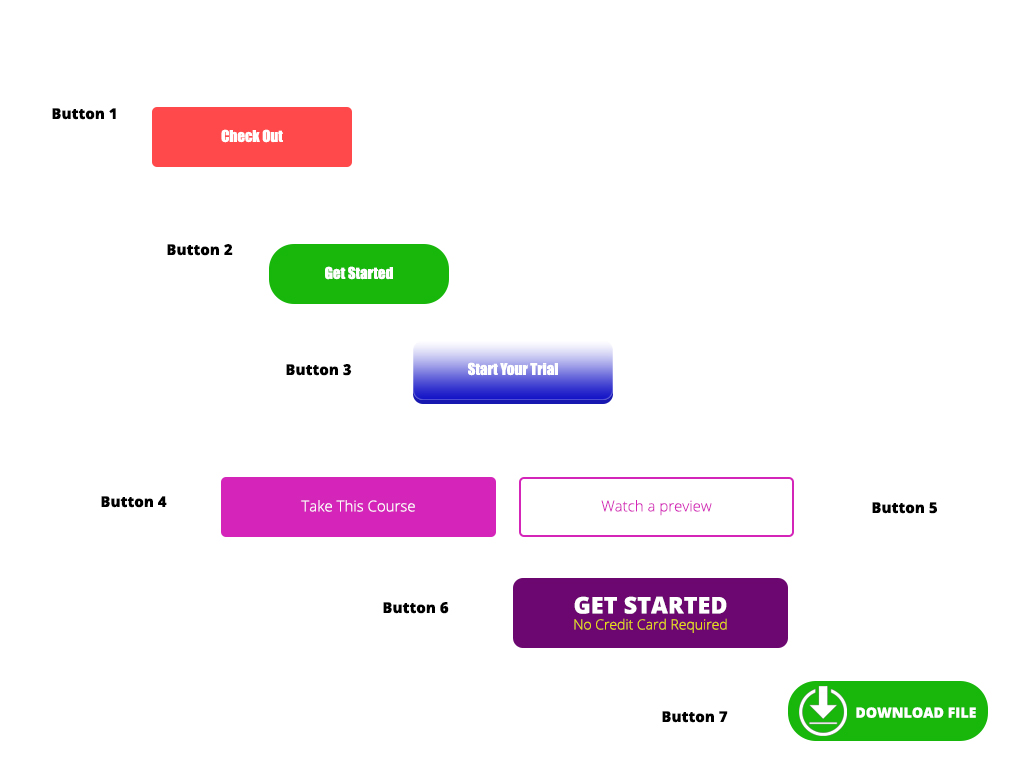
In this project we experiment with different types of Call To Action Buttons.
Button 1: Simple rounded rectangle with a radius of 5px and some text.
Button 2: Simple rounded rectangle with a radius of 25px and some text.
Button 3: Radius of 10px.
- Plus gradient overlay.
- Plus drop shadow.
- Plus inner shadow.
This makes the button look 3D (like it has depth).
Buttons 4 & 5: 5 is a duplicate of 4 but with no fill.
- Plus inside stroke.
The emphasis is now on the first button and not the second.
Button 6: Corner radius of 10px.
- Use of different fonts (including colour, style and weight).
- Top line uses the ALL CAPS transformation as well as tracking (letter spacing).
The second line gives the user an idea of what to expect if they click on the button.
Button 7: Add an icon.
- Downwards icon hints that this is a download.
